Fast, private email hosting for you or your business. Try Fastmail free for up to 30 days.
A Brief Addendum to the Apple Creator Studio Announcement on the UI of Apple Pro Apps
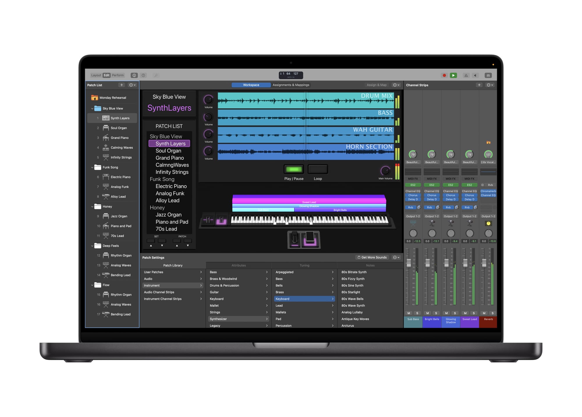
While skimming the media photos from Apple Creator Studio announcement, I was struck by the clean minimalism of Apple’s macOS “Pro” apps. They feel like the purest expression of macOS design: appropriately sized interface elements, a reasonable window corner radius, and blessedly little translucency. Controls and content fill the windows with nary a wasted pixel or blurry background in sight. The apps are focused on functionality and stripped of pretentiousness. They bring a sense of calm, orderliness, and clarity of purpose—we’re here to work. I don’t know if the Pro apps’ UI is a refinement of Liquid Glass or a renunciation of it, but it looks like what macOS should be. Even the iPad versions—including the newly released Pixelmator Pro, to a lesser extent—have a more restrained feel. If all macOS apps looked like they do in these perfectly curated marketing materials, I think many people, myself included, would be overjoyed.