Fast, private email hosting for you or your business. Try Fastmail free for up to 30 days.
Safari Tab Options in iOS 26
I’ve been using the iOS 26 betas since June, and I always try to live with the system defaults—there’s usually a good reason for that designation, and in my previous life, using the system the way most of Apple’s customers did was valuable. I usually adapt quickly to most design changes, but this year, one default was a deal breaker.
It’s the first setting I changed during the beta cycle—and again after my new iPhone arrived[1]: Safari Tabs, under Settings > Apps > Safari.
The iPhone 17 Pro in unobtrusive basic Blue. Despite my plan, I didn’t end up with Cosmic Orange—I found it overly conspicuous. Austin Mann got in my head. ↩︎
The default “Compact” option places the URL bar at the bottom for easy thumbing, but hides many of my oft-used selections behind an extra tap—especially the Share and New Tab buttons, which I use a hundred times a day to save links and open or switch tabs.

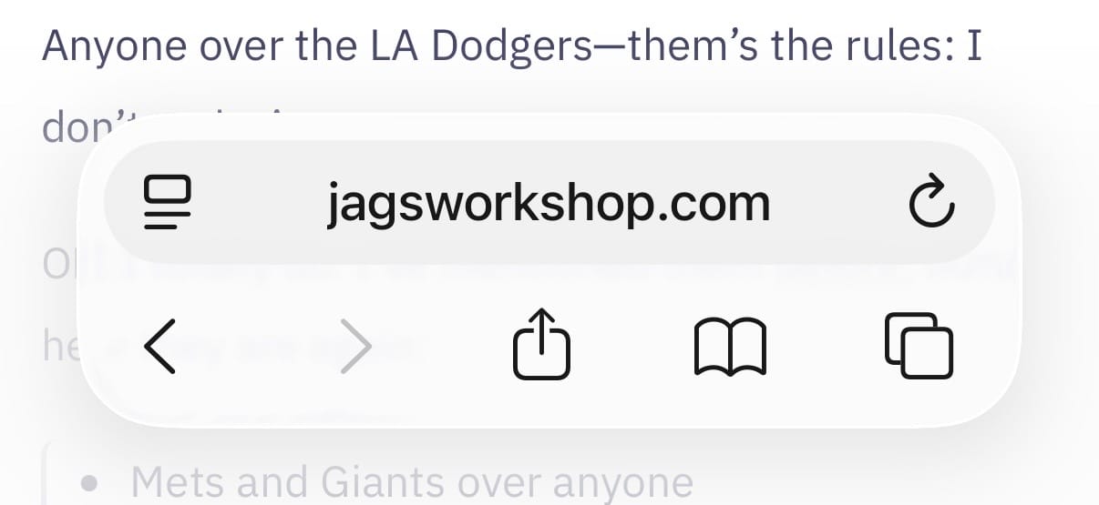
The “Bottom” option restores those buttons to a single tap at the expense of a double-height bar, and for my needs, is the clear winner.

If the double-height bar is not to your liking, the “Top” option splits the toolbar from the URL bar, keeping the former at the bottom, and moving the latter to the top of the screen.

I actually rather like this option for its minimal use of space at the bottom, but I’ve now gotten used to having the URL bar down there.
Thank goodness for options.

