Fast, private email hosting for you or your business. Try Fastmail free for up to 30 days.
Nerd Self-Sniping
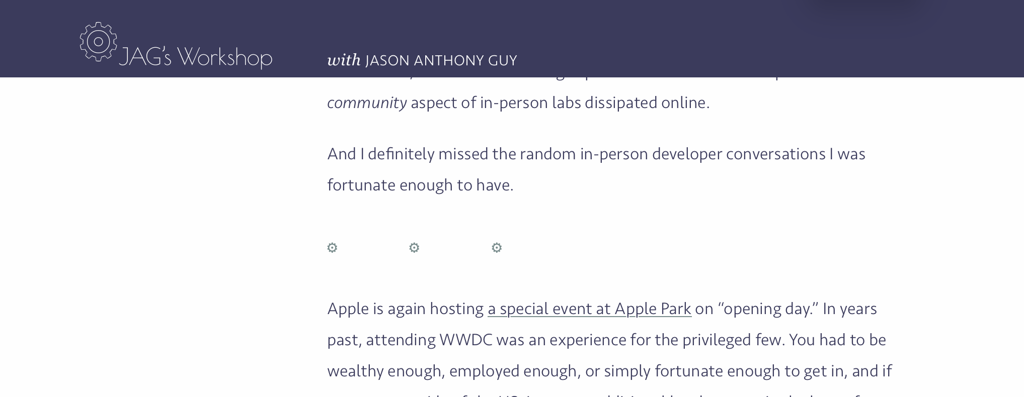
Sometimes unexpected bugs pop up at the worst time. Last night, I was preparing for bed and reviewing one of my pieces from March (Some Thoughts on WWDC25). When I reached the bottom, I saw this, and my heart skipped a beat.

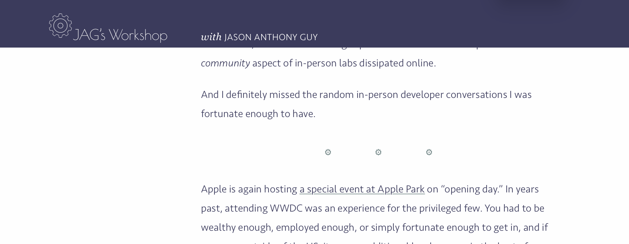
Those three gears, acting as a section divider, are supposed to be centered on the page, like so:

Oh no! My site’s broken! What the heck is going on here? That CSS code was written months ago, and had been working just fine. What changed? A quick check confirmed it wasn’t the code. I was using my iPad Pro 12" running iPadOS 26 beta 2, though, and on iOS 18, macOS 14 (Sonoma) and macOS 15 (Sequoia), everything was fine. Ah! A bug in a beta. Hardly surprising, so I wrote up a quick test case and submitted a bug report.
hr::before {text-align: center;} doesn't center, for my Apple friends.A few tests later, and I confirmed it was also happening on iPad and iOS 26 beta 3—but not on macOS 26 beta 2 or 3. It also fails in Chrome on macOS. Curious.
The code is dead simple and, admittedly, on the verge of hacky. This is the gist of it:
hr::before {
    content: "* * *";
    text-align: center;
}
This adds the pseudo-element before to the <hr> selector. The browser displays the content where the <hr> would go, and text-align: center, well, centers the content in the container. In theory, anyway.
(There’s a bit more to it to hide the normal horizontal line, change the font, and set the size, but those aren’t relevant here.)
As simple as this code was, the fix was even easier: add display: block, and everything works in all my tests.
Great, right? Bug filed, problem solved. I’d write it up for the site—a short post, with a wry observation about hacky solutions and unanticipated beta bugs, a link to the test case and the bug report, and Bob’s-yer-uncle.
Yeah, no.
I wanted to show the bug in action. Here’s what happens without display: block; here’s what happens with it. If you were on a system that behaved this way, you could see the before and after, interactively.
No, I don’t know why, I just did, OK? Be cool.
Anyway. Sometime around midnight I fired up my coding buddy and had it spit out a few lines of throwaway code. It gave some jibber-jabber about not using JavaScript because Ghost sanitized user-submitted HTML to prevent XSS and layout-breaking scripts blah blah blah.
(Ghost handles in-post JavaScript just fine.)
I assumed a five minute fix, and the basic solution was; but it was ugly and didn’t properly integrate with how code blocks look on this site, so I kept pushing. So, down the rabbit hole we went, iterating (and cursing) for four-plus hours, crafting a completely overblown set of HTML and CSS, until, at the very butt-crack of dawn, we finally had something that worked—and looked—as I wanted.
Which I then completely threw out this afternoon after asking my smarter coding buddy to help, and it did a much, much better job in much less time. (And used JavaScript.)
All so I can give you this. Behold!
hr::before {
content: "* * *";
text-align: center;
font-size: 1.5rem;
display: block;
}
Notice the beauty of a toggle instead of a checkbox! How display: block hides or shows as the toggle is activated! How (on affected devices…) the three asterisks are either centered or left-aligned to match the state of the toggle and code! How that code is syntax-color-coded! Pure CSS, HTML, and JavaScript magic!
Over four hours and a hundred lines of code (!) to demonstrate a trivial effect for a minor, rather inconsequential bug that could have been done in 30? Yeah, seems like a pretty colossal waste of time.
So when’s the next nerd snipe?

